When it comes to white walls, your options are endless. There are so many shades of white, and white is easily influenced by your interior furnishings, finishes and accessories. White is versatile, neutral but can also be tricky! White paint is never truly white–it typically has black and yellow pigment in it to create a softer look instead of clinical and stark.
We want to share our favourite shades of white paint, to help you create the interior look you want without painting twice!
Here are our two favourite neutral whites–
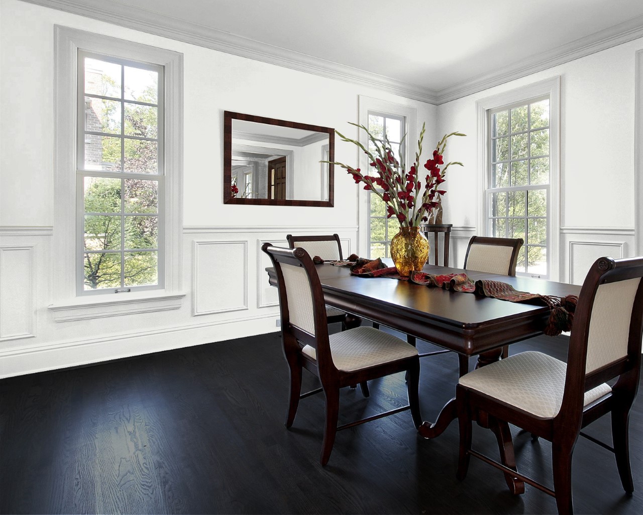
Cloverdale Paint Standard White
Colour Code: CA025
This white paint is our go-to! It’s very bright neutral and it’s easy to use with different types of sun exposures. If you’re going for the art gallery look with white baseboards, trim and walls we recommend this standard white throughout.
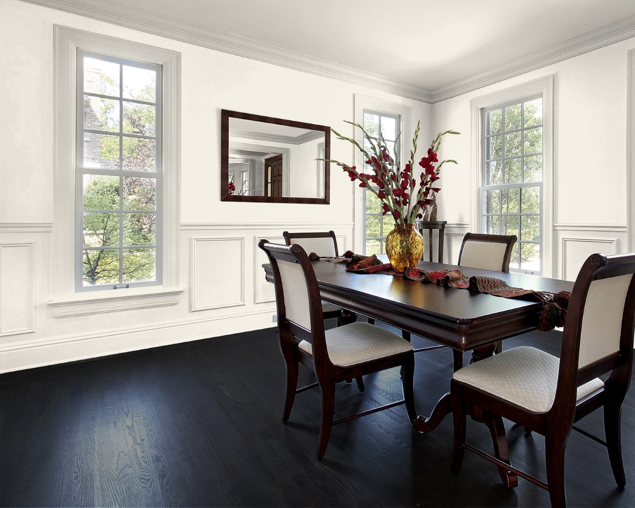
Cloverdale Paint Artisan White
Colour Code: CA013
Artisan White is a comparable neutral to Standard White, it’s just a touch more complex. This paint absorbs more light as it has more pigment in it, while still creating a beautiful bright white interior. Artisan White brings depth and sophistication to your space.
Here are our two favourite cooler and warmer whites–
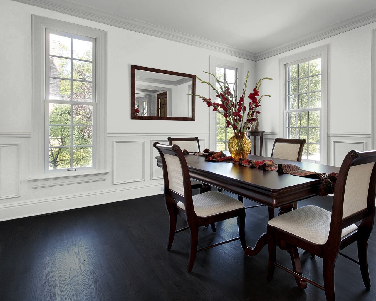
Cloverdale Paint Platinum
Colour Code: CA187
This white has blue pigment in it, which means it’s a cooler white. We recommend using this shade if you want to avoid warmth from surrounding interior finishes. For example, if you have oak flooring or cabinetry that can influence a warm reflection on your walls–this silver tone will help to cancel those yellow, orange and red tones.
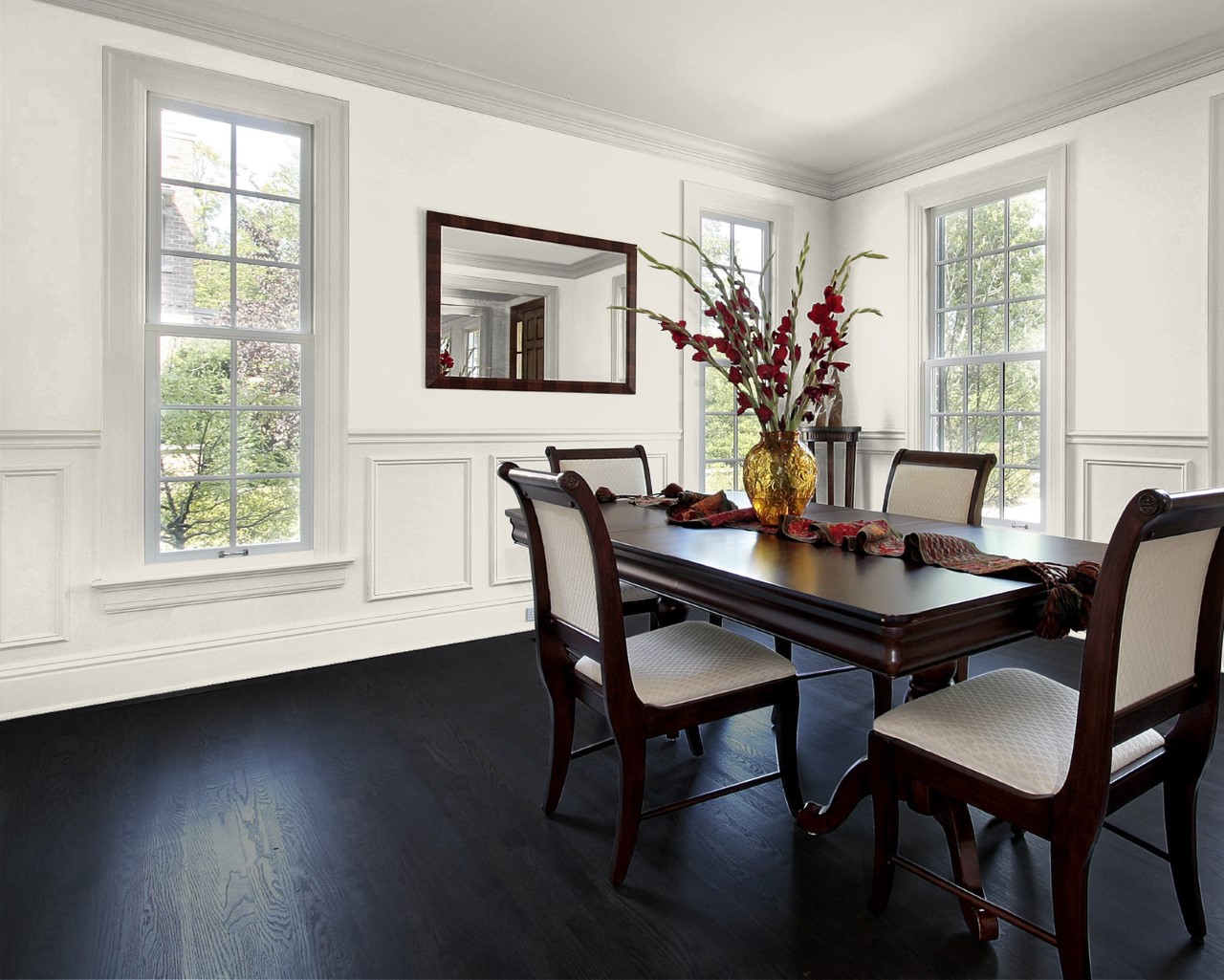
Cloverdale Paint Dove White
Colour Code: 0018
This white is the opposite of the above. It’s ideal for encouraging warm tones or fighting coolness. For example, if your new home is North Facing–you can use a warmer white paint to balance the cool sun exposure. This paint colour offers depth and rosy complexities to enhance warmth or cancel out blue and greens!